4.0 KiB
Use math. Display your empirical findings with charts and graphs.
Charts
A chart is used to map the numbers that you end up. Thanks to Obsidian plugin creating charts is a bit easier now (documentation) when needed. For example, a Sankey chart can be created like so:
type: sankey
labels: [Oil, "Natural Gas", Coal, "Fossil Fuel", Electricity, Energy]
series:
		- data:
			- [Oil, 15, "Fossil Fuels"]
			- ["Natural Gas", 20, "Fossil Fuels"]
			- ["Coal", 25, "Fossil Fuels"]
			- ["Coal", 25, "Electricity"]
			- ["Fossil Fuels", 60, "Energy"]
			- ["Electricity", 25, "Energy"]
priority:
			Oil: 1
			Natural Gas: 2
			Coal: 3
			Fossil Fuels: 1
			Electricity: 2
			Energy: 1
colorFrom:
			Oil: "black"
			Coal: "gray"
			"Fossil Fuels": "slategray"
			Electricity: "blue"
			Energy: "orange"
colorTo:
			Oil: "black"
			Coal: "gray"
			"Fossil Fuels": "slategray"
			Electricity: "blue"
			Energy: "orange"
Chart Terminology:
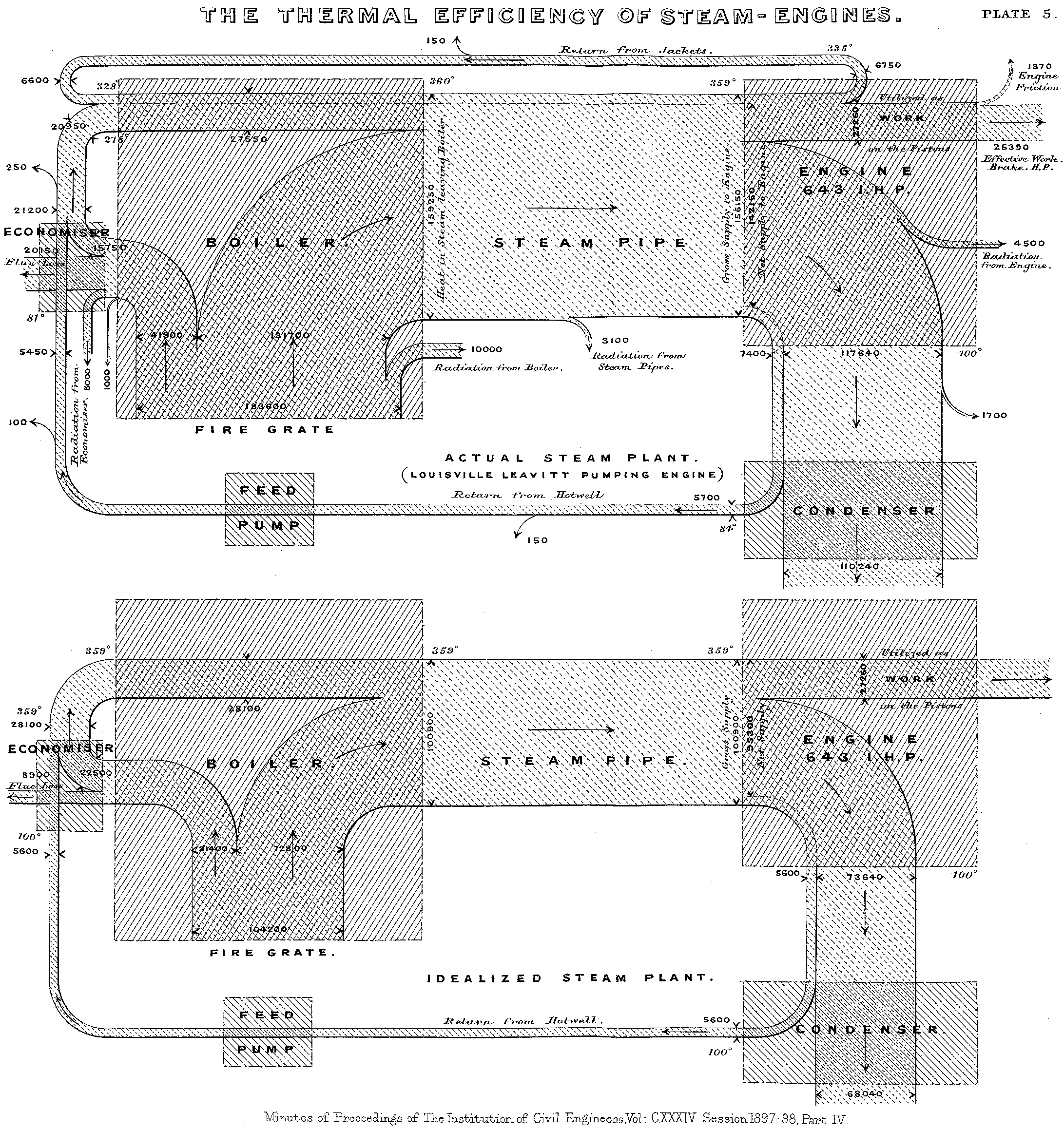
- Sankey Chart - a type of flow diagram that visualizes the flow of resources or information between multiple entities. It is particularly useful for showing the distribution of resources, such as energy, materials, costs, or information, through a system. The chart is named after Captain Matthew Henry Phineas Riall Sankey, an Irish engineer who created a diagram to represent the energy efficiency of a steam engine in 1898.
In a Sankey chart, entities are represented as nodes, and the flow between them is depicted as directed links or arrows. The width of the arrows is proportional to the quantity of the flow, making it easy to see the relative importance of different flows within the system. The chart is typically used to visualize the input, output, and transformation of resources within a process or system.
Sankey charts find applications in various fields, including energy management, resource allocation, finance, and environmental analysis. They are effective in communicating complex information in a clear and intuitive manner, helping stakeholders understand the distribution and utilization of resources within a system.
How to read: Identify the categories being shown. Follow the paths from one side of the chart to the other. Look out for the big values on each side, the widest connecting bands, the connections that create a trend and those that seem to buck the trend. These diagrams can get quite busy when made static so be sure to make this interactive.
- Heat Map - uses a matrix layout with color and shading to show the relationship between two categories of values. The values are presented along each axis and the corresponding cell is then color-coded to represent the relationship between the two categories. A heat map might be used to show the percentage of people surveyed in different countries (y axis) who voted for different favorite sports (x axis). The darker cells would indicate they were the most popular sports in each country.
An example of this would be the GitHub activity heat map. However, many more examples are also found in cases of biology and physics in research journals. There is additionally a heat map plugin inside of Obsidian.
How to read: Look for the general hierarchy of shades from the darkest (highest values) through the mid range shades and to the light shades (lowest).
Graphs
Desmos is a fantastic online graphing calculator utility. For additional math tools, read math software.
- A Bar Graph is easy to read but can have complex data
    type: bar
    labels: [Monday,Tuesday,Wednesday,Thursday,Friday, Saturday, Sunday,"next Week", "next Month"]
    series:
        - title: Title 1
	    - data: [1,2,3,4,5,6,7,8,9]
        - title: Title 2
        - data: [5,4,3,2,1,0,-1,-2,-3]

